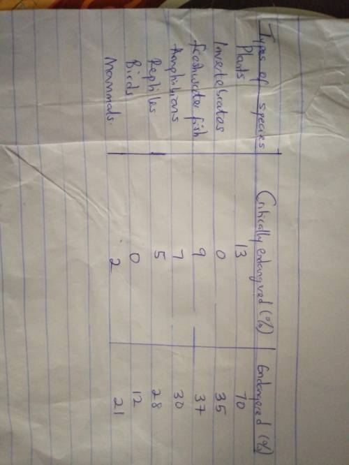
The table to this question is unclear, the detailed tabular form of this data has been attached.
The answer is BAR GRAPH
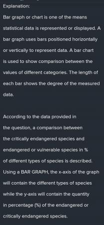
Explanation:
Bar graph or chart is one of the means statistical data is represented or displayed. A bar graph uses bars positioned horizontally or vertically to represent data. A bar chart is used to show comparison between the values of different categories. The length of each bar shows the degree of the measured data.
According to the data provided in the question, a comparison between the critically endangered species and endangered or vulnerable species in % of different types of species is described. Using a BAR GRAPH, the x-axis of the graph will contain the different types of species while the y-axis will contain the quantity in percentage (%) of the endangered or critically endangered species.
Note that, two different bars of different colors will be used to represent whether the species is endangered or critically endangered.
The table to this question is unclear, the detailed tabular form of this data has been attached.
The answer is BAR GRAPH
Explanation:
Bar graph or chart is one of the means statistical data is represented or displayed. A bar graph uses bars positioned horizontally or vertically to represent data. A bar chart is used to show comparison between the values of different categories. The length of each bar shows the degree of the measured data.
According to the data provided in the question, a comparison between the critically endangered species and endangered or vulnerable species in % of different types of species is described. Using a BAR GRAPH, the x-axis of the graph will contain the different types of species while the y-axis will contain the quantity in percentage (%) of the endangered or critically endangered species.
Note that, two different bars of different colors will be used to represent whether the species is endangered or critically endangered.
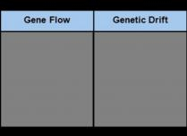
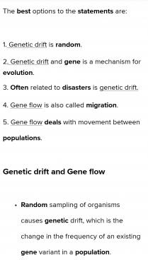
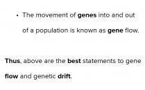
The T-chart by categorizing each statement as something that would most likely be relevant to gene flow or genetic drift. Some answers will fit in both columns depending on the situation. is random is a mechanism for evolution is often related to disasters is also called “migration” deals with movement between populations...
 319
319